
Style
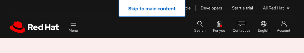
A skip link is designed to be easily seen once a user navigates to it.
Anatomy

- Text label
- Container
- Border
Theme
A skip link appears the same in both light and dark themes.

Configuration
A skip link’s bottom corners have a border radius of 4px, which matches the border radius of the call to action element. The top corners have a border radius of 0px to keep the top edge flush with the top of the page.
Placement
A skip link should be centered and aligned with the top edge at all viewport sizes. It also overlaps items at the top of the page.
Space

| Example | Token | Description |
|---|---|---|
| 16 | --rh-space-lg | 16px spacer |
| 32 | --rh-space-2xl | 32px spacer |
Interaction states
Interaction states are visual representations used to communicate the status of an element or pattern.
Focus
Because a skip link is in focus once it appears on the screen, the default and focus states are the same. The blue, 2px-wide border mimics the focus ring for other elements.

Hover

Active
Helpful tip
The Active state has the same styles as the Hover state.
Related elements or patterns
Feedback
To give feedback about anything on this page, contact us.
Red Hat legal and privacy links
- About Red Hat
- Jobs
- Events
- Locations
- Contact Red Hat
- Red Hat Blog
- Diversity, equity, and inclusion
- Cool Stuff Store
- Red Hat Summit
Red Hat legal and privacy links

